Navigating the Slide Landscape: Standard (4:3) vs. Widescreen (16:9)
The shape of your slides—aka the aspect ratio—can make or break how your presentation feels. It’s like choosing between skinny jeans and straight-fit trousers: both work, but the vibe is very different.
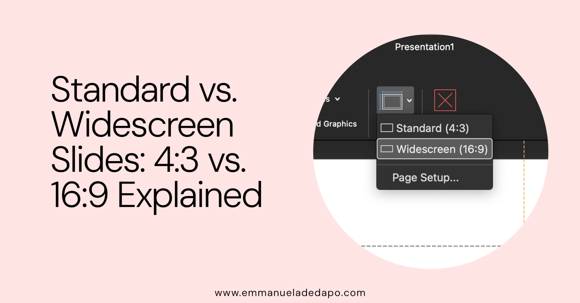
The two big contenders are the classic Standard (4:3) format and the modern Widescreen (16:9). Knowing their strengths, weaknesses, and best use cases can help you design slides that actually fit the moment.
Standard (4:3): The Old-School Classic
The 4:3 aspect ratio means four units wide for every three units tall—a squarish look that harks back to old TVs and computer monitors.
Why it mattered
- Historical roots: Once the default for early PowerPoint decks and projectors. Many older venues still run on this setup.
Advantages
- Vertical content friendly: Great if your slides are text-heavy or include tall images.
- Safe with older systems: Less risk of your content getting cropped on legacy projectors.
- Still fits some platforms: SlideShare and certain iPads (though fading) display 4:3 well.
Disadvantages
- Looks dated: On modern widescreens, 4:3 can feel retro in the wrong way.
- Less breathing room: Not ideal for wide charts, panoramic images, or multiple columns.
- Distortion danger: Stretching a 4:3 deck into 16:9 can warp your visuals.
Widescreen (16:9): The Cinematic Standard
The 16:9 aspect ratio is wider, sleeker, and matches the shape of modern TVs, laptops, and projectors. Think of it as giving your slides a Netflix glow-up.
Why it mattered
- HDTV era takeover: Became the standard alongside high-definition screens. PowerPoint has defaulted to it since 2013.
Advantages
- Modern, professional look: Fills the screen beautifully on today’s devices.
- More horizontal space: Perfect for charts, side-by-side visuals, and storytelling.
- Immersive feel: Works especially well with photo-heavy or video-embedded decks.
- Video-friendly: Matches YouTube, Vimeo, and most online video standards.
Disadvantages
- Less vertical room: Long lists or tall graphics may feel cramped.
- Older projector issues: Legacy systems may squish or letterbox widescreen slides.
- Awkward gaps: If you don’t design for widescreen, you risk empty white space.
Which Should You Choose?
✅ Go 16:9 if…
- You’re presenting on modern screens (laptops, TVs, new projectors).
- Your deck is heavy on visuals, videos, or charts.
- You want a polished, professional look.
- You’re creating content for YouTube, Vimeo, or online platforms.
✅ Go 4:3 if…
- You know your venue has older projectors.
- Your slides are mostly text or vertical content.
- You’re uploading to a platform that still favors 4:3.
- Your company has a big archive of 4:3 decks you need to match.
Best Practices
- Check the venue first: Always confirm what display you’ll be working with.
- Pick the ratio early: Changing later = headaches (and stretched logos).
- Have a backup: For high-stakes events, create both versions to cover your bases.
Final Thought
Whether you choose 4:3 or 16:9, the real win is making sure your slides don’t distract from your story. Aspect ratio isn’t just about looks—it’s about making sure your message lands smoothly on any screen.